3. Saint Laurent Paris
[ Art Direction / Brand Strategy ]

Established a new marketing strategy for Saint Laurent and produced a corresponding video.
The project was to explore the current positioning of Saint Laurent as a luxury brand and seek out strategies to increase customer awareness to develop into a luxury brand and draw trends. The brand values of this brand, pen portrait, competitors analysis, pop / pod, and primary research were investigated in detail and additional campaign video were produced. After rebranding from Yves Saint Laurent to Saint Laurent Paris, the brand identity has changed from luxury to rock chic. The earlier customer base of YSL (50s-60s). It was their goal to return to the main customer base of Saint Laurent as they pursued the younger elements. In addition, after re-branding, the 'Y' logo was still used in bags and accessories, confusing many customers. For that reason, presented a slogan 'y not' using two different messages. Firstly, 50s-60s generations of customers can enjoy wearing Saint Laurent’s rider jacket, a symbol of youthful enough. Moreover, images were made to imprint Saint Laurent without Y (Yves).
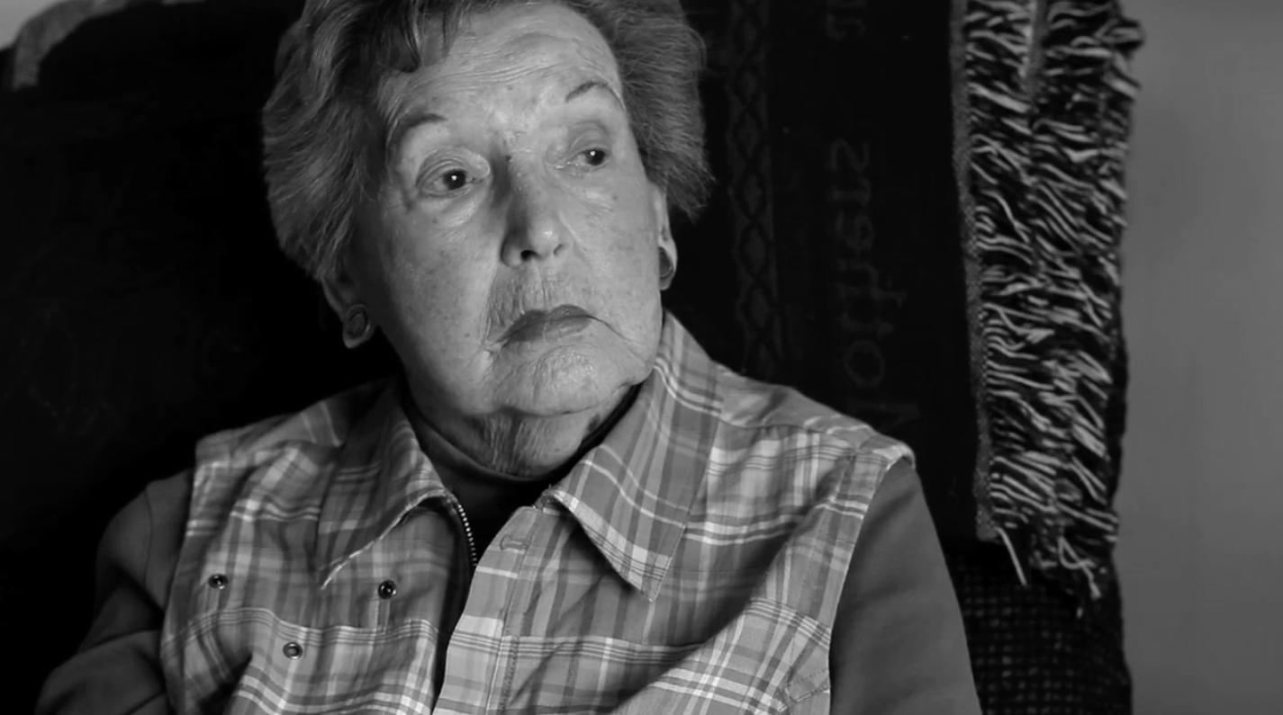
This video campaign was designed to target previous Yves Saint Laurant’s royal customers, currently at 50-60 years of age. The old lady in the clip represents Yves Saint Laurant customer before its rebranding. She reminisces about her old days when she used to be young, wild and dazzling.
“Can I go back to that old day..why don’t I give it a try?”
.
.
.
“Why not?”
Likewise, this video campaign implies Yves Saint Laurant’s customers of 50-60 years of age can enjoy the identity of Saint Laurent Paris despite its rebranding of young and chic. A lot of brands these days go through rebranding reflecting the modern trend, which brings confusion to their original customers. However, this type of campaign targeting the original customers can lead to higher brand awareness.


